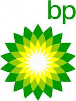
Logo Color Scheme
 Analogous
This logo uses the analogous colors of green, yellow green and yellow. I think the company probably chose these colors because it matches well with each other and pleasing to the eyes.
This logo uses the analogous colors of red, red orange, and orange. I think the company probably chose these colors because the company has to do with luxury and the colors next to each other looks fancy.
Complementary
 This logo uses complementary colors of yellow and purple. I think the company probably chose these colors because the numbers the jerseys would stick out.
This logos uses the complementary colors red and green. I think this company probably chose these colors because the colors complement each other.
Warm
This logo uses the warm colors of yellow and red. I think this company probably chose these colors because the restaurant looks more inviting and would make people want to come again.

This logo also uses the warm colors of yellow and red. I think this company probably chose these colors because the bag of chips stand out on the shelf.
 This logo uses the cool colors of a light and dark blue. I think the company probably chose these colors because water is represented as being cool.


This logo also uses the warm colors of yellow and red. I think this company probably chose these colors because the bag of chips stand out on the shelf.
Cool
 This logo uses the cool colors of a light and dark blue. I think the company probably chose these colors because water is represented as being cool.
This logo uses the cool color of blue. I think the company probably chose these colors
to represent refreshing after you brushed your teeth.
 This logo uses the monochromatic colors of green. I think the company probably chose these colors because when u think of nature and animals you normally think of the color green.
to represent refreshing after you brushed your teeth.
Monochromatic
 This logo uses the monochromatic colors of green. I think the company probably chose these colors because when u think of nature and animals you normally think of the color green.
This logo uses the monochromatic colors of brown. I think the company probably chose these colors because A&W is root beer and the color of root beer is brown.
 Triad Color
This logo uses the triad colors of red, yellow, and blue. I think the company probably chose these colors because the pop out and gets costumers attention.
This logo uses the triad colors of red, yellow and blue. I think this company probably chose these colors because
they go well with each other and look nice.
they go well with each other and look nice.


Comments
Post a Comment